Excerpt
Below you can preview Chapter 1 of the book. Alternatively, you can download the preview as PDF file below. Hopefully, you find the chapter interesting.
- preview.pdf (9.7 MB)
Enjoy!
Chapter 1
Introduction
Data have become a most valuable good. Doctors rely on rich databases about diagnoses and medications to give patients the best possible treatments. Enterprises generate profits based on data about needs and preferences of potential customers. Scientists make new discoveries and contribute to a vast body of scholarly data.
Data are everywhere in the information age. Data are collected by huge numbers of devices equipped with various sensors. A smartphone with a dozen and more different sensors is not uncommon. Data are also generated computationally. Sophisticated models are constructed and simulated in an attempt to estimate how our climate may look like in a few centuries. And we as humans are sources of data as well. Social networks and messaging services record our interests and daily activities.
Now with so much data available, the question is how can we make sense of them? Well, the data have to be explored and analyzed in order to derive valuable information. To this end, a channel has to be established for the data to enter into the human mind where insight can be generated. The classic way of ingesting data is to decipher alphanumerically encoded transcripts, or simply texts. Yet, reading piles of documents is too time consuming. Therefore, data are often aggregated in reports, which may contain structured tabular information. This already helps in extracting the key messages. But complex relationships within the data may still be too difficult to identify.
This is where interactive visual data analysis enters the stage. While text and reports are serial media, where one piece of data has to be processed after the other, visual methods aim for the human visual system at its full bandwidth. Humans are amazingly fast in extracting information from graphical depictions. Graphical means are not only beneficial for communicating information, they also serve as scaffolds for human sensemaking. Mental models can be established more easily with the help of visual abstractions and visually acquired information can be remembered better than textual descriptions.
We all know the idiom: “A picture is worth a thousand words.” But this is not quite right. More correct would be “A picture can be worth hundreds of thousands of words.” This slightly provocative statement hints at two important aspects. First, can be suggests that there are not only good visual representations of data but also exemplars that are not so helpful. Second, the increase in the number of words is to indicate that, in the information age, we are facing big data.
This book is about concepts and methods for the interactive visual analysis of large and complex data by jointly exploiting the power of humans and computers. In this book, you will learn that solutions for interactive visual data analysis are not created in passing. Careful design is necessary before expressive visual representation can be shown on a computer display. Useful interaction is essential to enable users to engage in a dialog with the data and the information contained therein. Especially in the light of big data, we need support from analytic computations to help us extract interesting features from the data.
1.1 Basic Considerations
Before we go into any details about interactive visual data analysis, let us briefly look at some fundamental terms, ideas, and concepts.
1.1.1 Visualization, Interaction, and Computation
Visualization is a computational process that generates visual representations of data. A first definition has been established by visualization pioneers in 1987. Their definition reads as follows (McCormick, DeFanti, and Brown 1987):
Visualization is a method of computing. It transforms the symbolic into the geometric, enabling researchers to observe their simulations and computations. Visualization offers a method to see the unseen. It enriches the process of scientific discovery and fosters profound and unexpected insights.
This definition describes a transformation that involves several entities and steps. First, there are the data into which we seek insight. Second, there is the computer that transforms the data into visual representations. Finally, there is the human who is making sense of the visual representation.
Visual representations are fundamental for visually driven data-intensive work, but they alone can hardly satisfy all the analytic needs we are facing in the information age. We need support from interaction mechanisms and computational analysis methods.
Already in 1981, Bertin recognized the need for interactively adjustable visual representations (Bertin 1981):
A graphic is not ‘drawn’ once and for all; it is ‘constructed’ and reconstructed until it reveals all the relationships constituted by the interplay of the data. The best graphic operations are those carried out by the decision-maker himself.
Interaction adds the necessary flexibility to visualization. It allows us to actively take part in the visual data analysis. We may want to focus on different features of the data, look at the data from different perspectives, or adjust visual representations so as to crystallize the desired insights.
While interaction incorporates human competences into the sense-making process, automatic computational methods utilize the power of the machine. Large and complex data usually cannot be visualized in their entirety. Automatic computational analyses crunch the data in search for characteristic features or meaningful abstractions that are easier to digest than the raw data.
The important interplay of visualization, interaction and computational analysis is summarized in the Visual Analytics Mantra by Keim and colleagues (Keim et al. 2006):
Analyse First –
Show the Important –
Zoom, Filter and Analyse Further –
Details on Demand
According to this mantra, visual analysis starts with an automatic analytic phase. The important features extracted in this phase are then visualized. Via interaction, the visual representation is adjusted, the data are filtered, and further analytic computations are triggered. Details are readily available upon request.
This tight interleaving of computational and human efforts is the key benefit of interactive visual data analysis as a knowledge-generation approach. The computer can process large amounts of data quickly and accurately. The human has enormous pattern-detection abilities and is proficient in creative thinking and flexible decision-making.
A direct consequence of the interplay of data, humans, and computers is that knowledge from different fields has to be brought together for a successful data analysis. Relevant topics include visual design, computer graphics, human-computer interaction, user interfaces, psychology, data science, and algorithms, to name only a few. The need to get diverse methods work in concert makes the development of practical solutions a non-trivial endeavor.
1.1.2 Five Ws of Interactive Visual Data Analysis
In order to come up with helpful data analysis tools, their context of use needs to be taken into account in the first place. One way to describe the context is to follow a variation of the Five Ws: What, why, who, where, and when.
What data are to be analyzed?
There are many different types of data, such as player statistics, census data, movement trajectories, and biological networks. Each type of data comes with its own individual characteristics, including data scale, dimensionality, and heterogeneity.
Why are the data analyzed?
The objective is to help people accomplish their goals, for example, finding governing factors in a gene regulatory network. Goals typically involve a number of analytic tasks, such as identifying data values or setting patterns in relation.
Who will analyze the data?
A doctor who studies data in day-to-day clinical routine needs different analysis tools than a strategic investor who is exploring streams of news data in search for new market opportunities. Individual abilities and preferences play a role as well.
Where will the data be analyzed?
The regular workplace is certainly the classic desktop setup with a display, mouse, and keyboard. Yet, there are also large display walls and interactive surfaces that offer new opportunities for interactive visual data analysis.
When will the data be analyzed?
As with any tool, visualization, interaction, and computation are means that must be at hand at the right time. A data analysis may follow domain-specific workflows where each step is associated with its own individual requirements.
These Five Ws suggest that there are many factors influencing the development of data analysis tools, including data types, analytic tasks, user groups, display environments, domain conventions, and so forth. Factors related to the What and the Why are crucial for the practical applicability of data analysis tools. Certainly, any visually driven and interactively controlled tool has to consider human factors, the Who, with regard to perceptual, cognitive, and physical abilities, expertise, background, and preferences. The Where and When aspects become increasingly relevant when the data analysis runs on multiple heterogeneous displays, supports collaborative sessions, or follows domain-specific workflows.
In the light of the Five Ws it is clear that an interactive visual data analysis solution, in order to be successful, has to be tailored for a specific purpose and setting. Given the wealth of analytic questions we are facing in the information age, a large variety of concepts and techniques is needed. Next, we look at a few introductory examples.
1.2 Introductory Examples
So far, we have sketched the basic idea of interactive visual data analysis on a rather abstract level. In the following, a series of examples will demonstrate the communicative power of visual analysis approaches, on the one hand, and the involved design decisions and challenges, on the other hand.
The examples will take us from basic visual representations to advanced analysis scenarios. On the way, we will increase the degree of sophistication of the examples by enhancing the visual mapping, integrating interaction mechanisms and automatic computations, combining multiple views, incorporating user guidance, and considering multi-display environments.
1.2.1 Starting Simple
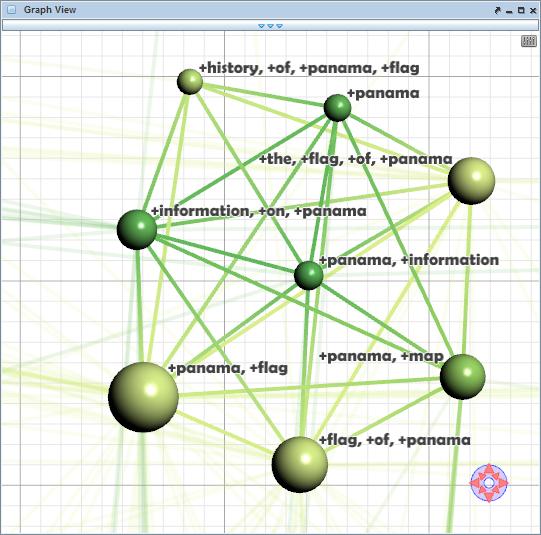
The data we will analyze are graphs (the What). Graphs are a general model for describing entities and relations among them. They are universally useful in many different domains. Biologists model natural phenomena via gene regulation networks, climate researchers make use of climate networks to simulate weather on earth, and crime investigators sketch connections between suspects to solve complicated cases. Typical examples from our daily lives are computer networks and social networks.
A graph generally consists of nodes, edges, and attributes. Nodes represent entities, whereas edges represent relationships between the entities. Nodes as well as edges can have attributes that store additional information.
Before we start with visual examples, let us first take a look at the raw data to be visualized. Listing 1.1 shows our graph stored in the JSON format. Lines 2–11 contain three nodes, each associated with an id and a label. Lines 14–22 define two edges. Edges are specified between a source node (src) and a destination node (dst), both referenced by their id. An additional attribute stores the weight (or strength) of the connection between the two nodes.
Our listing with three nodes and two edges is only an abbreviated view as indicated by the comments in lines 12 and 23. The graph that we are about to visualize actually contains 77 nodes and 254 edges. It captures the co-occurrence of characters in the chapters of Victor Hugo’s Les Misérables.
01: {
02:   "nodes": [
03:     { "id": 0,
04:       "label": "Myriel"
05:     },
06:     { "id": 1,
07:       "label": "Napoleon"
08:     },
09:     { "id": 2,
10:       "label": "Mlle Baptistine"
11:     },
12:     // More nodes here ...
13:   ],
14:   "edges": [
15:     { "src": 1,
16:       "dst": 0,
17:       "weight": 1
18:     },
19:     { "src": 2,
20:       "dst": 0,
21:       "weight": 8
22:     },
23:     // More edges here ...
24:   ]
25: }
Listing 1.1: A graph with nodes, edges, and attributes
With only the listing of the graph, it is extremely difficult to make sense of the information hidden in the data. Therefore, we (the Who) will now perform a visual analysis to gain insight into the graph. In the first place, we are interested in the structure of the graph (the Why).
 |
 |
| (a) Plain structure. | (b) Encoding degree via color. |
 |
 |
| (c) Encoding degree via color and size. | (d) Encoding weight via line width. |
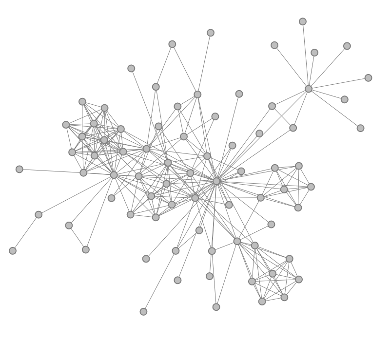
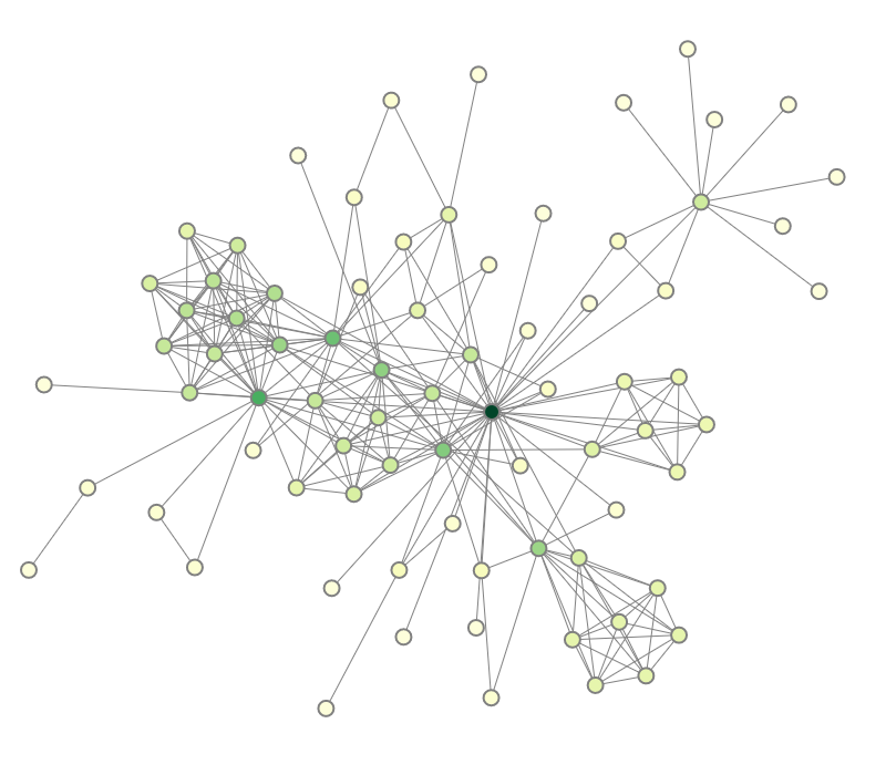
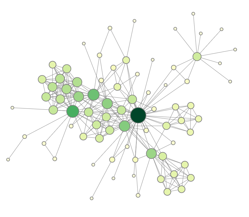
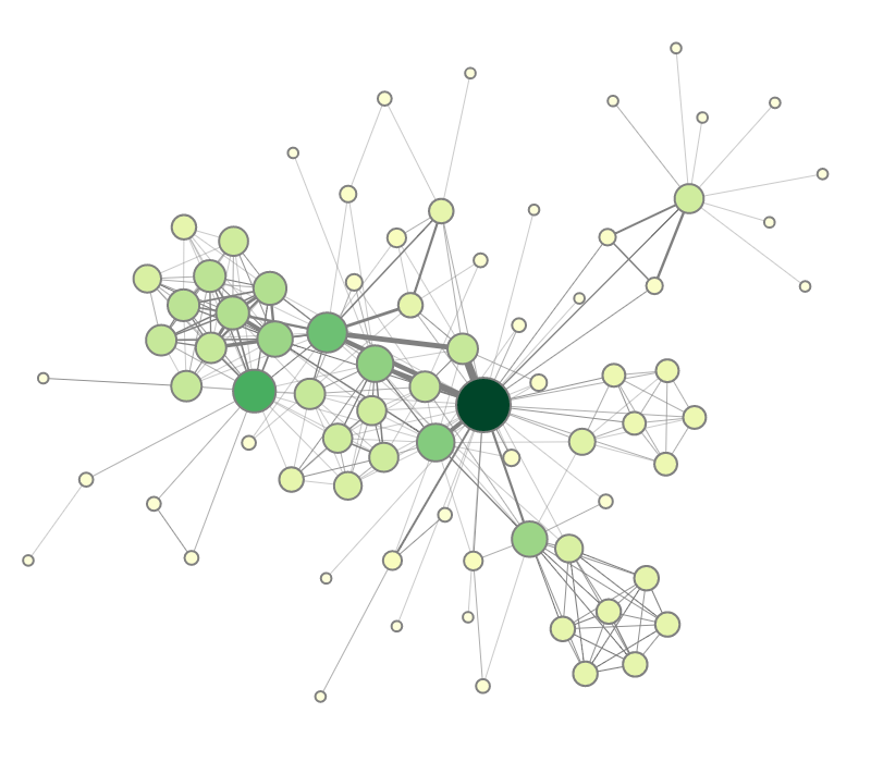
Figure 1.1: Node-link diagram visualizing a graph's structure and attributes. 
A basic method for visualizing graphs is a node-link diagram. Figure 1.1(a) shows such a simple visual representation of the graph. Nodes are visualized as dots, and edges are represented as links between the dots. There are many different options for laying out the dots on the display. In our case, a force-directed layout algorithm has been applied. As we can see, the structure of the graph, that is, who is connected to whom, becomes quite clear, merely by drawing dots and links.
Let us refine our interest in the data. We are now interested in who are the major characters with the most connections to other characters. We can already extract this information by looking at the number of edges that are connected to a node. Yet, it is a bit cumbersome to count edges, and the clutter of edges makes counting difficult anyway. So how can we make the desired information more readily visible?
The number of edges per node is also called the node degree. This derived numeric attribute can be visualized alongside the graph structure. To this end, we assign to each dot a color that represents the node degree. Dark green nodes exhibit a large node degree, while light green nodes have a low degree. 1.1(b) illustrates the color coding. With this enhanced node-link diagram, we can immediately identify the dark green dot in the center of the figure as the major character in the network.
But we are still not fully satisfied. Low-degree nodes are of the same size as the important high-degree nodes. We want to further accentuate the important characters in the network and attenuate the less relevant supporting characters. Complementing the color coding, we vary the size of the dots depending on the node degree. As can be seen in 1.1(c), it is now much easier to assess the importance of characters.
Our visual representation is now quite expressive in terms of information about the nodes of the graph. However, the edges have received only little attention. To render a more complete picture of the data, it would be nice to visualize the edge weight as well. This can be achieved by varying the width of the lines connecting the colored dots. In 1.1(d), bold lines indicate strong edges, whereas thin lines stand for weak edges. With this additional visual encoding, we can easily see to whom a character is most prominently connected.
In summary, we have now visualized the graph structure and two associated graph attributes. The structure is nicely visible as dots and links. The two attributes node degree and edge weight are encoded visually via color plus size and line width, respectively. The resulting visual representation enables us to see the key characteristics of the data. By reading the data’s textual representation we could have obtained the same characteristics, but it would have cost us much more time and painstaking brainwork.
1.2.2 Enhancing the Data Analysis
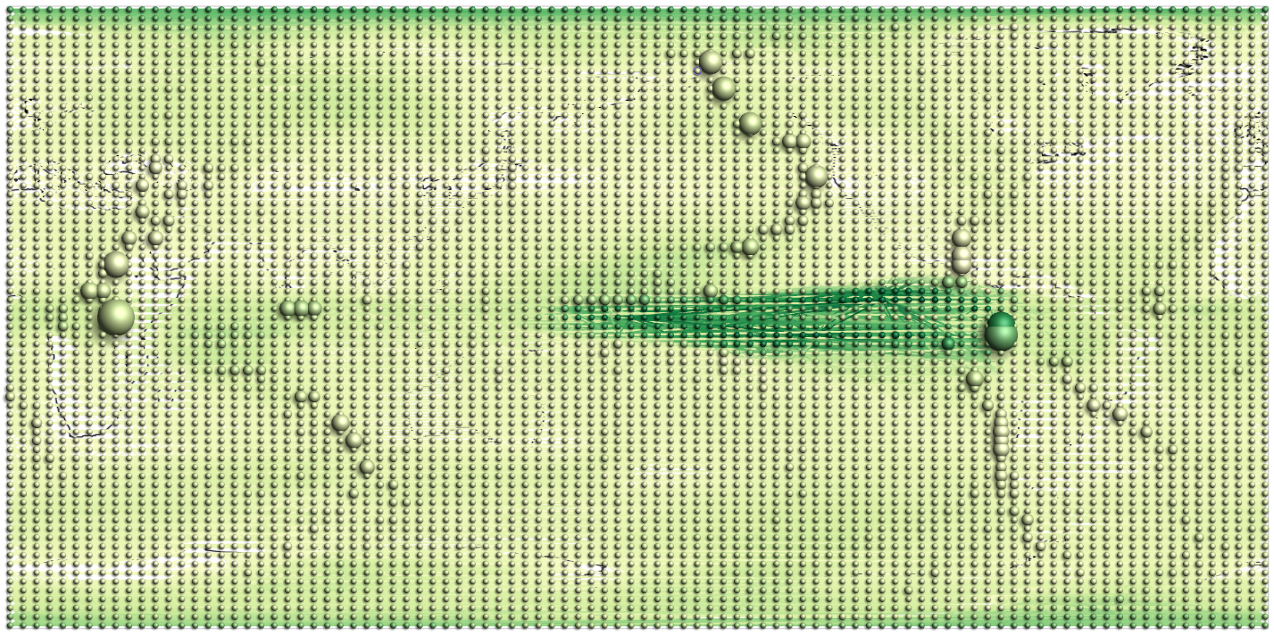
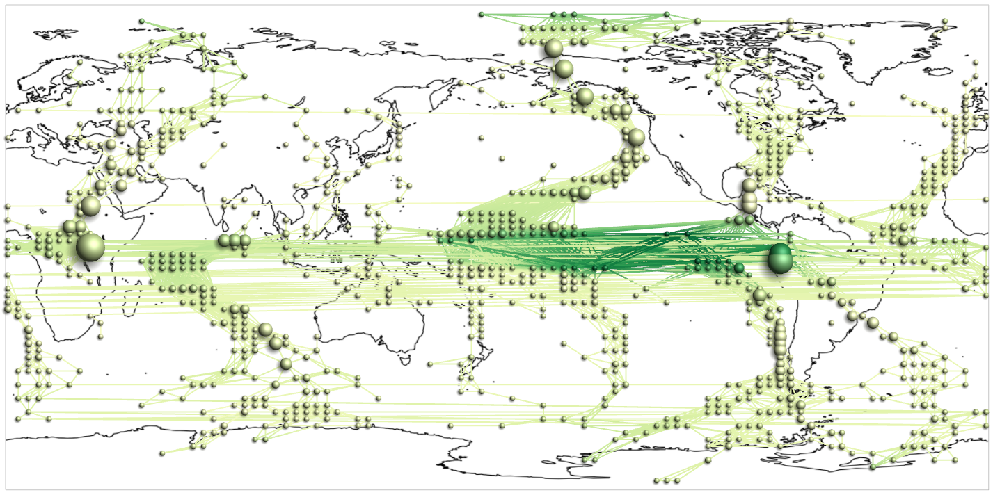
The previous simple examples illustrated the potential of visualization. Yet, simple visual representations alone are often not enough to solve more complex problems. The graph that we visualized consisted of 77 nodes and 254 edges only. However, it is not uncommon to work with graphs with thousands of nodes and edges, and dozens of attributes. Climate networks are an example of such large and complex graphs. They are generated from large-scale simulations of meteorological phenomena with the goal to better understand and predict the development of climatic conditions on earth.
 |
 |
| (a) Full graph with 6,816 nodes and 116,470 edges. | (b) Filtered graph with 938 nodes and 5,324 edges. |
Figure 1.2: Dynamic filtering to focus on relevant parts of a climate network.
With increasing size and complexity of the data, we have to go beyond the simple visual representations introduced earlier. When visualizing large data, we risk ending up with visual representations that are cluttered. Adequate countermeasures have to be taken. Moreover, it is hardly possible to encode all aspects of the data into a single image. It is rather necessary to provide multiple views on the data, where each view emphasizes a particular data facet. The next two examples illustrate these lines of thought.
Consider the climate network visualized in Figure 1.2(a). It contains 6,816 nodes and 116,470 edges. Its visual representation is actually a mess; there are simply too many dots and links. What can we do about this? A standard approach in such situations is to focus on relevant subsets of the data. Subsets can be created dynamically using interactive filtering mechanisms that enable users to specify the parts of the data they are interested in.
For the climate network we may be interested in those nodes that are crucial for the transfer or flow in the network. Such nodes are characterized by a high centrality, a graph-theoretic measure. An automatic algorithm can be used to calculate the centrality for each node of the network. Then it is up to the user to determine interactively a suitable threshold for filtering out low-centrality nodes and their incident edges.
Figure 1.2(b) shows the climate network where nodes with a centrality below 65,000 have been filtered out. As a result the visual representation contains only those graph elements that are relevant with respect to the interest of the user. Now, there are no more than 938 nodes and 5,324 edges. This obviously reduces clutter and generates a better view on the structures hidden in the data.
With dynamic filtering as described so far, it is possible to deal with problems caused by data size. Another challenge is data complexity. It relates to the many semantic aspects that may be linked to the data. We already mentioned the graph structure and the graph attributes as important aspects. Additionally, there can be spatial and temporal aspects. A climate network is usually given in a spatial frame of reference and it may also be subject to change over time. In order to understand data comprehensively it is necessary to understand the individual aspects and their interplay. This requires multiple dedicated visual representations, each addressing the particularities of a specific aspect. Figure 1.3 depicts a system where multiple views work in concert to visualize our climate network. Without going into too much detail, there are a density plot (top left), a node-link view combined with a map (center), a globe view (right), a multivariate attribute plot (below node-link and globe), a filter slider (bottom), and a few auxiliary controls. All these views are linked. That is, picking a data item in one view will highlight that item in all other views. This linking among views is essential for integrating the different data facets and enabling the user to form a comprehensive understanding of the data.
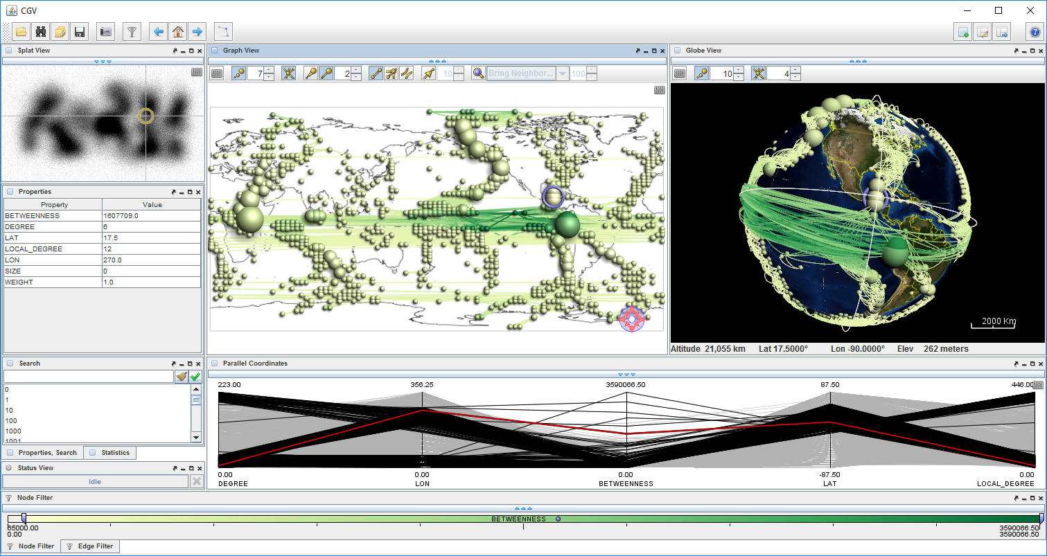 |
Figure 1.3: Multiple-views visualization of a climate network.
1.2.3 Considering Advanced Techniques
In the previous paragraphs, we computed graph-theoretic measures, added interactive filtering, and combined multiple linked views to create a comprehensive overview of the data. But how far can we get with interactive visual data analysis? Certainly, there are limits. The visualization has to fit into the available display space. Interaction should not overwhelm users with too many things to carry out manually. Analytic computations have to generate results in a timely fashion.
As we try to push these limits, we have to consider advanced techniques. For the purpose of illustration, we briefly look at two examples. One aims to guide users during the data analysis and the other to expand the screen space for visualization.
It has already been mentioned that interaction is crucial to creative sense-making. However, interaction can also be demanding. The user has to deal with several questions: What can I do to get closer to my goal, which action sequence do I have to take, how are the individual interactions carried out? An advanced visual analysis system is capable of providing guidance to assist the user in answering such questions.
We illustrate such guidance by the example of another common question: Which part of the data should be visited? A typical approach to study data more closely is to zoom in as shown in Figure 1.4(a). Note that we visualize a different graph now, a graph about co-occurrence of search engine query keywords with 2,619 nodes and 29,517 edges. While zoomed in, it is possible to see details, but only for a fraction of the graph. So, the data analysis is an iterative process during which one part of the graph is visited after the other. This iterative process requires users to answer the question where to go next. Should the user be hesitant to continue the navigation of the data, this may indicate that guidance should be provided (the When).
 |
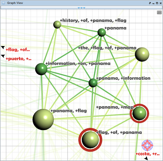 |
| (a) Where should I go next? | (b) Visual cues hint at candidates! |
Figure 1.4: Guidance provides assistance during data navigation.
If this is the case, a computational method scans the immediate neighborhood of the currently visible part of the graph in search for nodes or edges that are potentially interesting according to a user-specified degree-of-interest (DoI) function. The visual representation is then enhanced with visual cues that point at the most promising candidates. Figure 1.4(b) shows a few nodes emphasized with red circles. These nodes are worth investigating in detail. Moreover, arrows at the view border suggest directions in which further interesting nodes can be found. The user is free to follow the given recommendations or to continue the exploration otherwise. Of course, guidance is a delicate means of user support. If guidance is obtrusive, users may not accept it. If it is well-balanced, however, guidance can be a valuable tool.
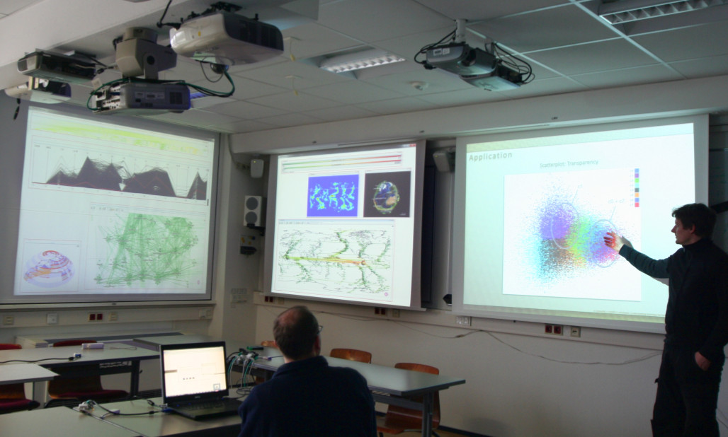 |
Figure 1.5: Visual data analysis in a multi-display environment. Reprinted from (Radloff, Luboschik, and Schumann 2011).
For our second example of advanced visual data analysis, we are addressing the screen space limit. When pushing this limit, a natural step forward is to go for bigger displays. Instead of working in the classic desktop environment, several displays are combined to form so-called multi-display environments (the Where). As shown in Figure 1.5, there are stationary public displays and dynamic private displays, which can enter and leave the environment as needed. Each display may contain several views and the views can be focused and re-arranged to suit the analytic situation at hand.
On the one hand, multi-display environments provide more space for displaying visual representations at high resolution. There can be even multiple users working collaboratively to analyze the data. On the other hand, new challenges need to be tackled. How to distribute views on the displays, how to deal with users occluding the displays, and how to interact with views at the greater scale? Finding answers to these questions and supporting the user in such potent workspaces is part of ongoing visualization research.
In this section, we presented a series of visualization examples. We started with basic visual encodings, incrementally enhanced the visual representations, and finally looked at some advanced techniques. These examples are kind of a teaser of what to expect from this book. The next section will provide some more detailed information on the book structure.
1.3 Book Outline
This book is structured into six chapters: the first introductory chapter you are currently reading plus five chapters on interactive visual data analysis to come. Figure 1.6 provides an overview of the chapter structure.
- Chapter 2 is concerned with fundamental aspects pertaining to interactive visual data analysis. We will look into design criteria, factors influencing the design, and models describing the involved processes.
- Chapter 3 is about visualization. You will learn about the basic methods of visual encoding and presentation, and about various visualization techniques for different types of data.
- Chapter 4 is dedicated to interaction. The chapter discusses general interaction concepts and illustrates how interaction techniques can facilitate the visual data analysis in many ways.
- Chapter 5 deals with automatic computations to support the visual data analysis. The primary goal will be to reduce the complexity of the data and their visual representations.
- Chapter 6 sheds some light on advanced concepts for interactive visual data analysis, including multi-display visualization environments, user guidance, and progressive visual data analysis.
- Chapter 7 will briefly summarize the book and outline ideas for readers to continue with the topic of interactive visual data analysis.
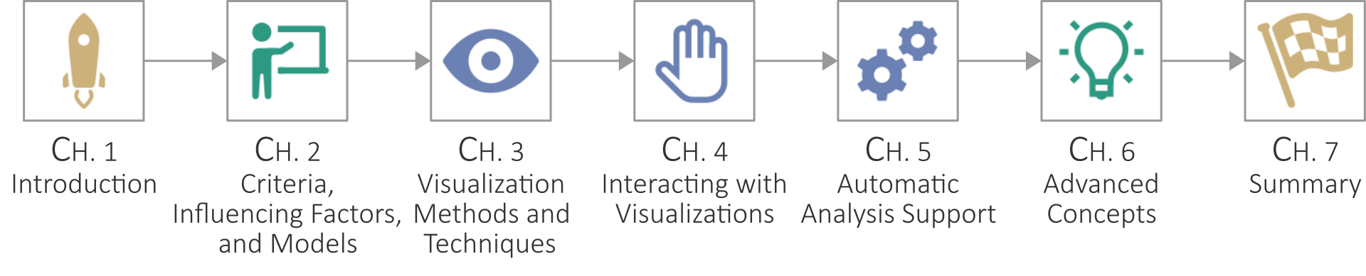 |
Figure 1.6: Chapter structure of this book. Icons by icons8.com.
Further Reading
General Literature: (Schumann and Müller 2000) • (Spence 2007) • (Ward, Grinstein, and Keim 2015)
Chapter 2
Criteria, Factors, and Models
Interactive visual data analysis is highly context-dependent. We will need different techniques for analyzing time-series data than for graph data. We will want to use completely different visual representations for getting an overview of the overall data distribution than for inspecting individual patterns and trends. And we will most likely interact differently when working with data on an interactive surface as compared to a standard desktop.
There is no silver bullet solution that simply scales to all possible analysis scenarios. If there was such a universal approach, there would be no necessity for this book.
The first step to designing context-dependent solutions is to know the fundamental requirements posed by interactive visual analysis scenarios. This aspect will be addressed by introducing corresponding criteria in Section 2.1. Second, we need to describe the influencing factors that characterize analysis scenarios. This primarily concerns the data to be analyzed and the tasks to be accomplished, but also the people who carry out the analysis and the environment in which it takes place. These influencing factors will be dealt with in detail in Section 2.2. Finally, we need to understand the fundamental processes behind interactive visual data analysis. These will be discussed in Section 2.3, where we cover the design process, the data-transformation process, and the knowledge-generation process. Throughout this chapter, we will use illustrating examples to convey the major points.
2.1 Criteria
If you want to be successful in analyzing data with interactive visual tools, you cannot just create an arbitrary visual representation, add some interactivity to it, and spice it with a little computational support. Much of the potential of interactive visual data analysis would be wasted. Even worse, you could end up with findings that are simply not true. Any follow-up decisions based on your analysis would be tainted.
Consider for example the visual representation ...
-- snip --
Read more in the book...
Bibliography
- Bertin, Jaques. 1981. Graphics and Graphic Information-Processing. de Gruyter.
- Keim, Daniel A., Florian Mansmann, Jörn Schneidewind, and Hartmut Ziegler. 2006. “Challenges in Visual Data Analysis.” In Proceedings of the International Conference Information Visualisation (Iv), 9–16. IEEE Computer Society. doi: 10.1109/IV.2006.31.
- McCormick, Bruce H., Thomas A. DeFanti, and Maxine D. Brown. 1987. “Visualization in Scientific Computing.” ACM SIGGRAPH Computer Graphics 21 (6): 3. doi: 10.1145/41997.41998.
- Radloff, Axel, Martin Luboschik, and Heidrun Schumann. 2011. “Smart Views in Smart Environments.” In Proceedings of the Smart Graphics, 1–12. Springer. doi: 10.1007/978-3-642-22571-0_1.
- Schumann, Heidrun, and Wolfgang Müller. 2000. Visualisierung: Grundlagen und Allgemeine Methoden. Springer. doi: 10.1007/978-3-642-57193-0.
- Spence, Robert. 2007. Information Visualization: Design for Interaction. 2nd ed. Prentice Hall.
- Ward, Matthew O., Georges Grinstein, and Daniel Keim. 2015. Interactive Data Visualization: Foundations, Techniques, and Applications. 2nd ed. A K Peters/CRC Press.
Figure Credits
- Figures 1.1-1.4 and 1.6: Released under the Creative Commons Attribution 4.0 International License (CC BY 4.0). The figures are available on https://ivda-book.de.
- Figure 1.5: Reprinted by permission from Springer Nature Customer Service Centre GmbH: Radloff, A. et al. “Smart Views in Smart Environments”. In: Proceedings of the Smart Graphics. Springer, 2011, pp. 1–12. doi: 10.1007/978-3-642-22571-0_1, © 2011.